As employee of health system, every week I will check our lab for leaks or instrumental issues. Meanwhile, I am using the following code to check daily increasing cases in US state-county level every morning.
I think three signals are crucial for community level data and every community and people should decide their own timeline for normal live to survive in this pandemic and potential recession in the following months or years:
Positive rate of testing is decreasing to ~1%. In this case, the testing ability should be enough to screen all the potential infected people.
Daily increasing hospitialized number is less than the sum of dischared patients and dead people. In this case, the medical resources should reach the peak.
Daily death numbers reached the peak and decrease for two weeks. In this case, the susceptible individuals in the community shoud be either infected or isolated and we could start to consider the cease of lockdown of local community.
STATE
Data source is New York Times.
library(tidyverse)

file <- read.csv('https://github.com/nytimes/covid-19-data/raw/master/us-states.csv',stringsAsFactors = F)
file$date <- as.Date(file$date)

# Check States with max case larger than 10000 and more than 100 deaths
df <- file%>%
    group_by(state)%>%
    mutate(change=c(0,diff(cases)),change2=c(0,diff(deaths)))%>%
    filter(max(cases)>10000 & max(deaths)>100)%>%
    ungroup()

df %>%
    ggplot(aes(x=date,y=change,fill=state)) +
    geom_point() +
    geom_smooth() +
facet_wrap(~state,scales = 'free') 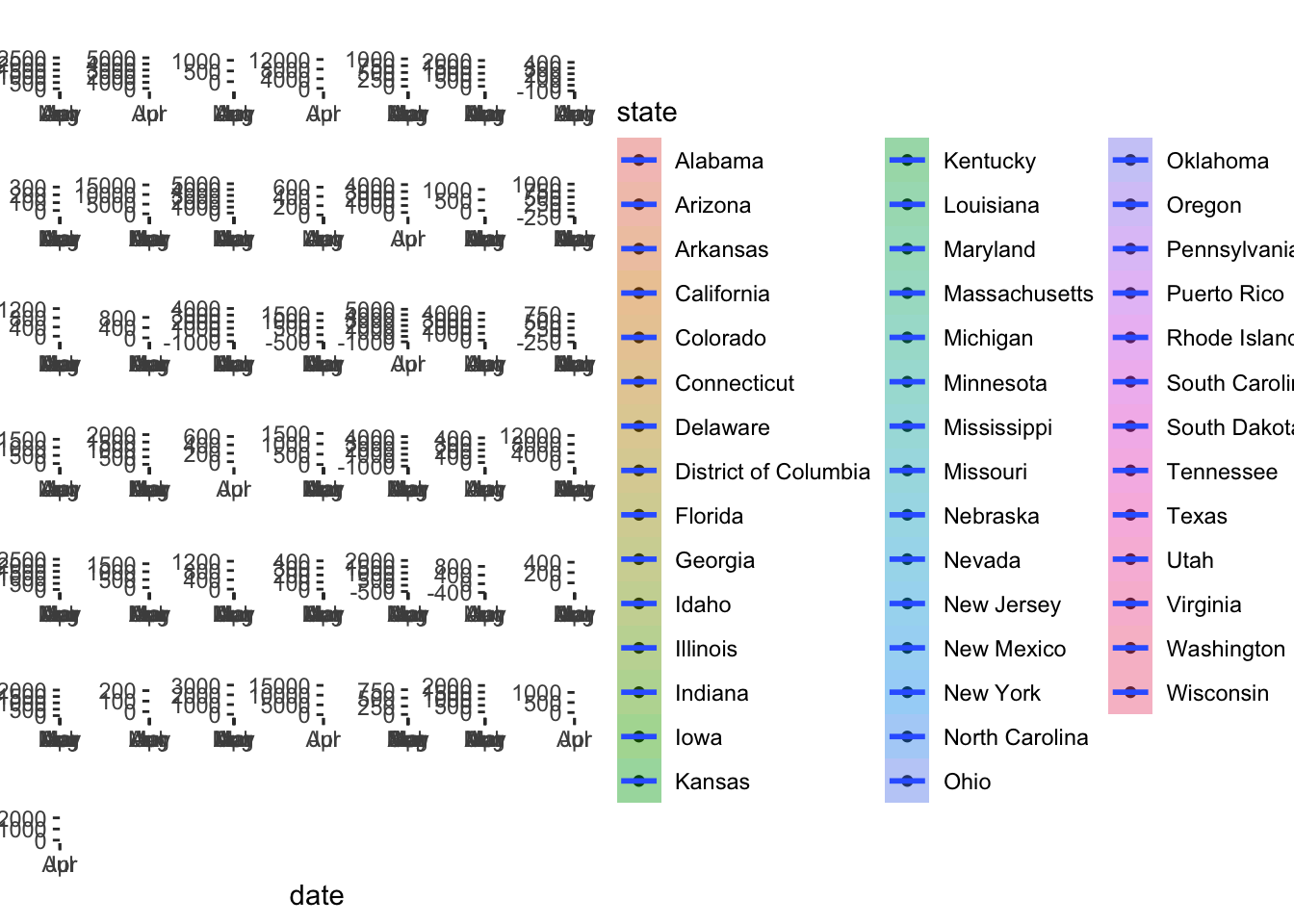
df %>%
    ggplot(aes(x=date,y=change2,fill=state)) +
    geom_point() +
    geom_smooth() +
facet_wrap(~state,scales = 'free') 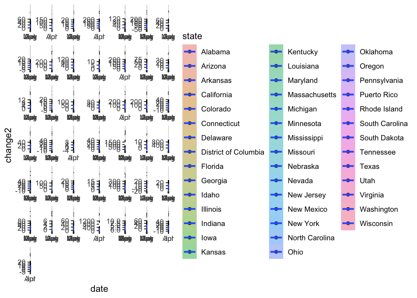
COUNTY
Data source is New York Times.
file <- read.csv('https://github.com/nytimes/covid-19-data/raw/master/us-counties.csv',stringsAsFactors = F)
file$date <- as.Date(file$date)

library(tidyverse)
# Check Counties with max case larger than 10000 and more than 100 deaths
df <- file%>%
    group_by(county,state)%>%
    mutate(CaseChange=c(0,diff(cases)),DeathChange=c(0,diff(deaths)))%>%
    filter(max(cases)>10000 & max(deaths)>100)%>%
    ungroup()

df %>%
    ggplot(aes(x=date,y=CaseChange,fill=state)) +
    geom_point() +
    geom_smooth() +
facet_wrap(~county+state,scales = 'free') 
df %>%
    ggplot(aes(x=date,y=DeathChange,fill=state)) +
    geom_point() +
    geom_smooth() +
facet_wrap(~county+state,scales = 'free') 
## NYC zipcode
## covid19nyc <- read.csv('https://raw.githubusercontent.com/nychealth/coronavirus-data/master/tests-by-zcta.csv')
Test
Data source is covidtracking.com
daily <- read.csv('https://covidtracking.com/api/v1/states/daily.csv',stringsAsFactors = T,header = T)
daily$date <- as.Date(daily$dateChecked)

dd <- daily %>%
    group_by(state)%>%
    mutate(posrateChange=positiveIncrease/totalTestResultsIncrease,recin = c(0,-diff(recovered)))%>%
    ungroup()
# pos rate changes
dd %>%
    filter(state=='NY')%>%
    ggplot(aes(x=date,y=posrateChange)) +
    geom_point() +
    geom_smooth()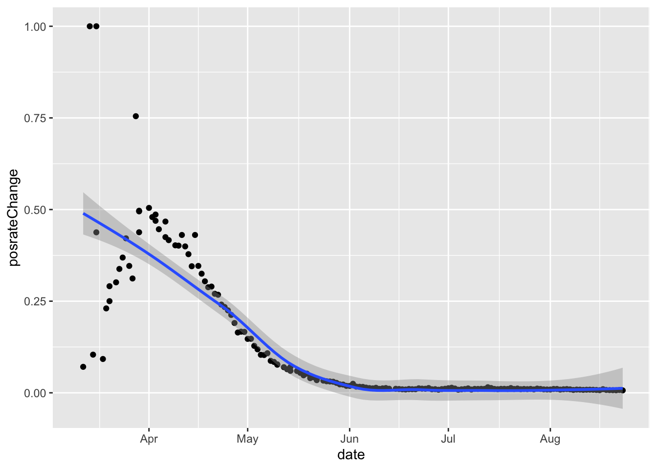
# hospitialized/death/recover daily increase in NY
dd %>%
    filter(state=='NY')%>%
    tidyr::pivot_longer(col=c('hospitalizedIncrease','deathIncrease','recin'),names_to = 'condition',values_to = 'count') %>%
    ggplot(aes(x=date,y=count,color=condition)) +
    geom_point() +
    geom_smooth()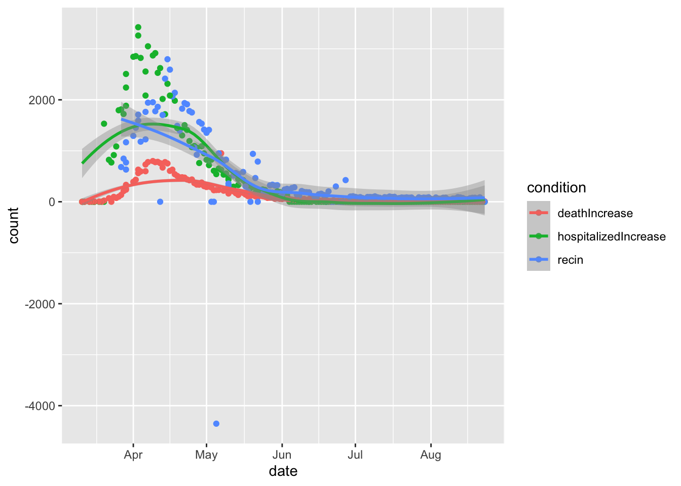
# hospitialized/death/recover daily increase in States with more than 10000 positive cases
dd %>%
    group_by(state) %>%
    filter(positive>10000) %>%
    ungroup() %>%
    tidyr::pivot_longer(col=c('hospitalizedIncrease','deathIncrease','recin'),names_to = 'condition',values_to = 'count') %>%
    ggplot(aes(x=date,y=count,fill=condition)) +
    geom_point(aes(col=condition)) +
    geom_smooth()+
    facet_wrap(~state,scales = 'free')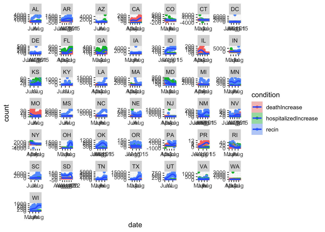
Those numbers are real people.